Sloneek Is Changing The Image

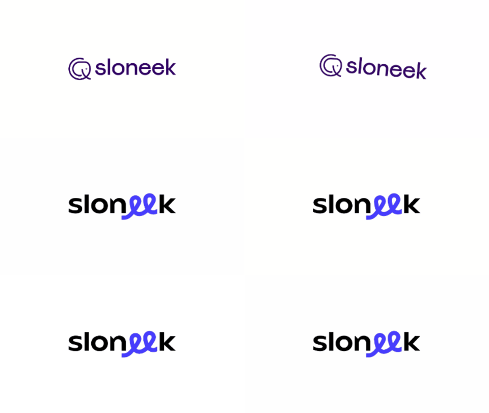
We’ve grown up. We’re no longer a small Czech-Slovak team of friends but a well-known functioning startup that has managed to make a name for itself in abroad and acquire the confidence of investors. So, the following change is necessary. To say goodbye to our elephant in the logo.
“The logo was cobbled together without much of a concept when Sloneek, that was developed from the original iDovolenka system, was established. At that time, no expansion was expected. The fact that the connection between the elephant and the name can be actually used only in local markets wasn’t expected as well,” says Radim Švajner, Marketing Manager of Sloneek.
Over the years, a lot of people have become fond of Sloneek and they see the elephant as an icon that points to friendship, humanity, deliberation or wisdom. However, some people considered the brand to be immature, even childish. Although we don’t agree, we feel that it’s time to move on.
We’re a technological, modern startup, trendsetters in the field of HR and our brand and logo should reflect the qualities and know-how built up over the years.
“We had to persuade people that we understand what we do, we‘re technologically skilled and the brand and app are really simple. The new logo should represent all of that,” explains Radim Švajner.
New image, same values
So, we spoke to Studio Garcy headed by Tom Garcy. He was given the task to reflect our transformation and values in a new logo and colours.
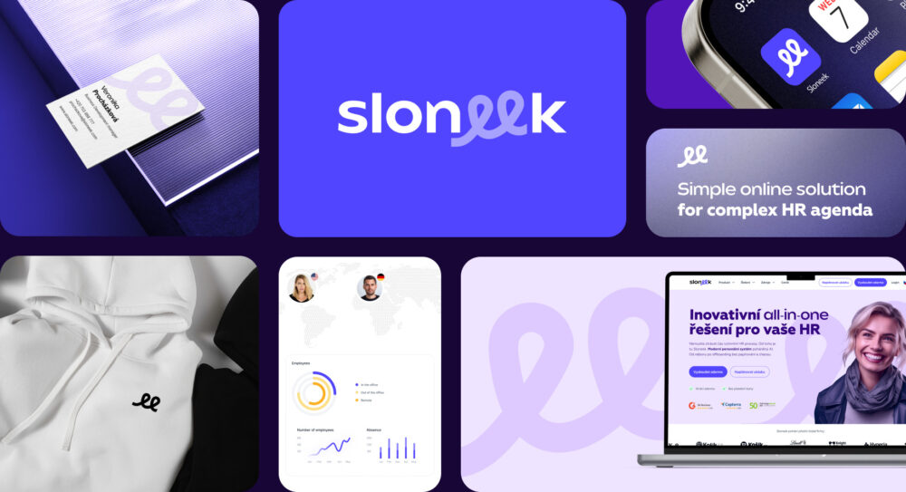
This is the result.
Purple has turned into a shade of blue-violet that has been using in some features for several years. It evokes technological focus of Sloneek more.
The logo symbolizes the connection and relationships, power of the team and key 1:1 meetings. It represents the bridges between HR and teams and fluent communication necessary not only in HR but also in relationships in general. It doesn’t matter if it’s about the relationship within the company or personal ones. It reminds that humanity is in the centre of everything what we do.
There’s no day-to-day transformation. So, our rebranding will be step by step. In the following weeks, the website, marketing materials, company merch and the app will undergo the transformation.
In spite of the fact that our image has been changed, the aim is still the same. We would like to continue to make everyday work for HR people as easy as possible, to rid them of nonsense paperwork and give them back their time to work with people.


